![]()

Exploring Color Blending Techniques on Fabric
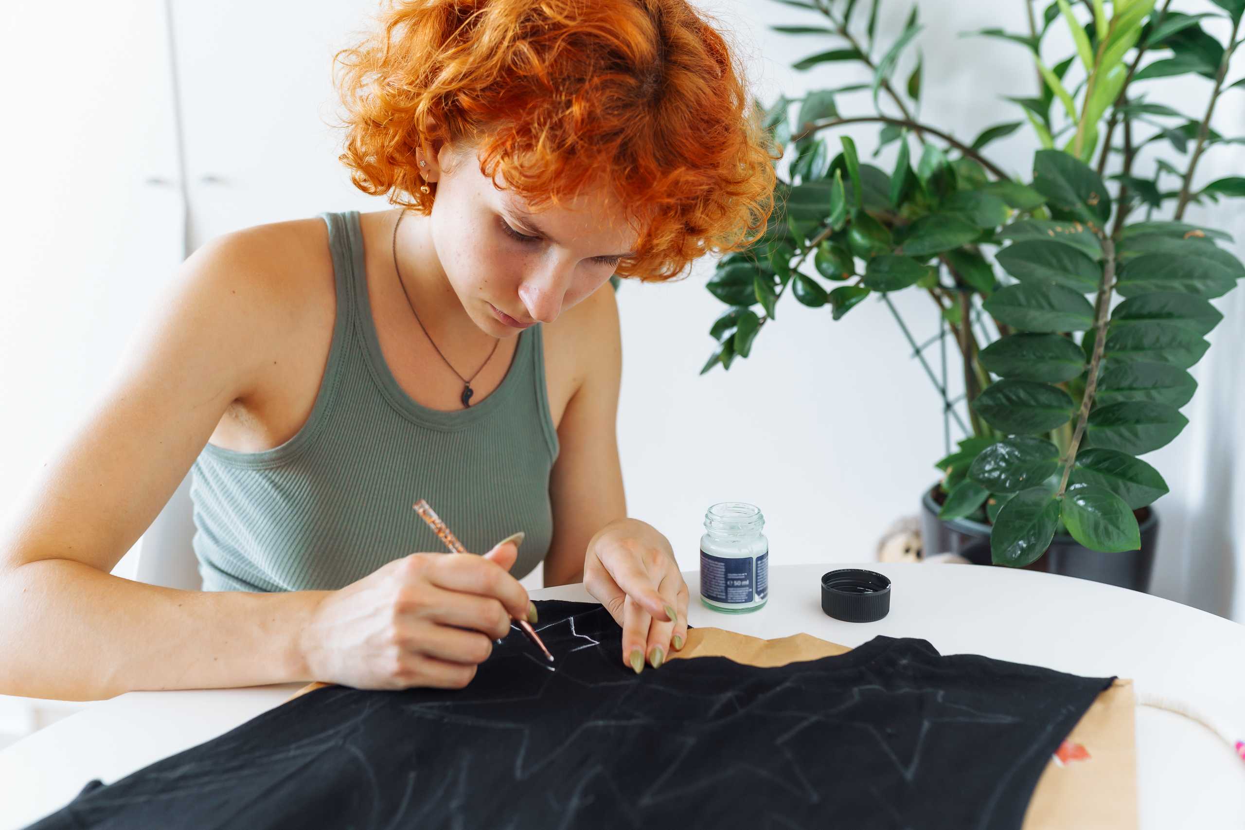
Creating depth and vibrancy in fabric painting often comes down to mastering color blending techniques. With the right approach, even simple patterns can appear dynamic and three-dimensional.
Understanding Color Combinations
Before you start blending, consider your color palette carefully:
- Complementary colors: Colors opposite each other on the color wheel create bold contrasts.
- Analogous colors: Colors next to each other blend smoothly for a harmonious look.
- Neutral tones: Soft backgrounds or muted shades help accentuate bright patterns.
Experimenting with different combinations can transform a flat design into something lively and eye-catching.
Blending Techniques
There are several ways to achieve smooth transitions on fabric:
- Wet-on-wet: Apply a second color while the first is still wet for natural mixing.
- Layering: Paint successive layers of color, letting each dry partially to build depth.
- Dry brushing: Use a lightly loaded brush to softly merge colors without overpowering details.
Each technique creates a different effect, allowing you to customize your designs.
Tips for Smooth Gradients
To make your blended patterns seamless:
- Work quickly to avoid harsh edges.
- Use soft brushes or sponges for gradual transitions.
- Test colors on a scrap fabric before applying to the main piece.
Patience and careful observation help ensure that your gradients look polished and intentional.
Bringing Designs to Life
Blending is not just about technique—it’s about expression.
- Experiment with bold transitions for modern, abstract pieces.
- Use soft blends for delicate, floral motifs.
- Combine multiple blending styles in one design to create unique textures and depth.
With practice, blending colors on fabric becomes intuitive, allowing every project to shine with vibrancy and originality.